User Interface & Visual Identity
Role: Graphic Designer
Disciplines: Brand Design
Technical: Adobe Illustrator
Client: CanadaScaffold
Description
CanadaScaffold is a scaffolding company based in Canada. This project is defined as redesigning the Canadascaffold company logo, so that the current logo structure would not look that different, simultaneously a refining touch would make it better.
Process
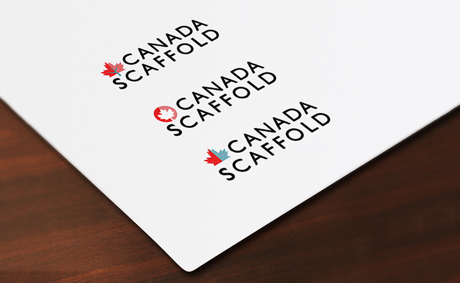
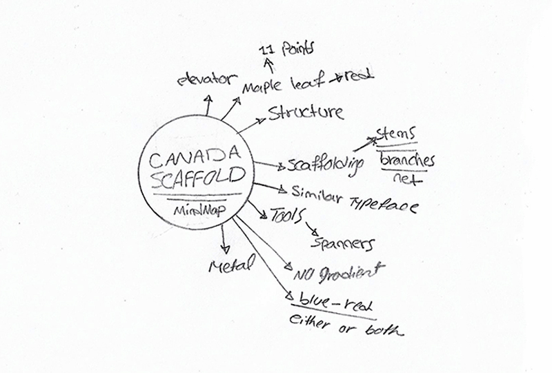
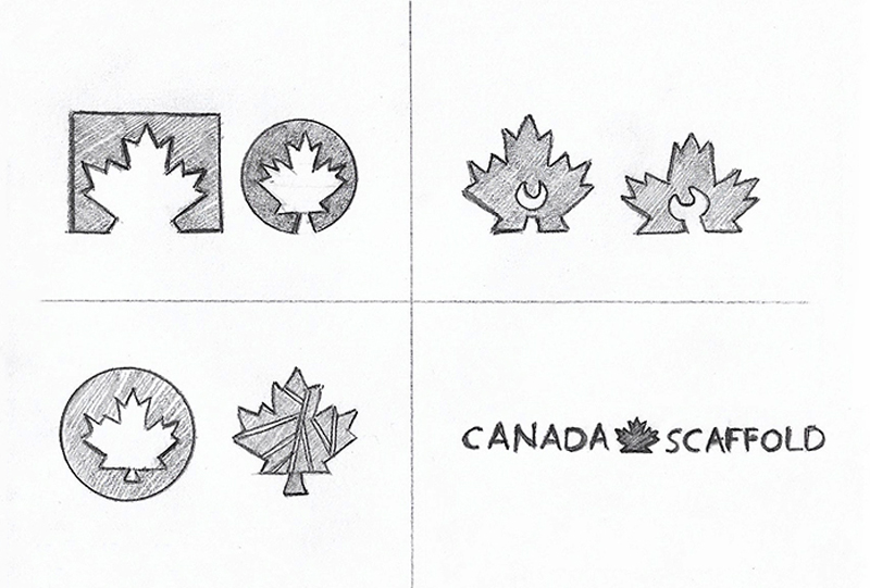
The current logo is a type-logo with a maple leaf in the middle. Retaining the look and feel of the current logo, I applied a similar typeface and kept the maple leaf in the logo. Then I removed the gradient from the type-logo and sketched a few thumbnails for the maple leaf to replace it with the current one. The blue and red colours are used in the design, are the Canadascaffold colour scheme. The first logo result demonstrates the concept of Scaffolding with showing the branches on the leaf. The second one illustrates the safety and security with the maple leaf surrounded by a circle. I remained loyal to the Canadascaffold colour scheme by using both red and blue colours in the last result.
Result


