User Interface & Visual Identity
Role: Interface & User Interface Designer
Disciplines: UI, UX
Technical: Balsamic, Invision, Photoshop
Client: British Columbia Institute of Technology
Description
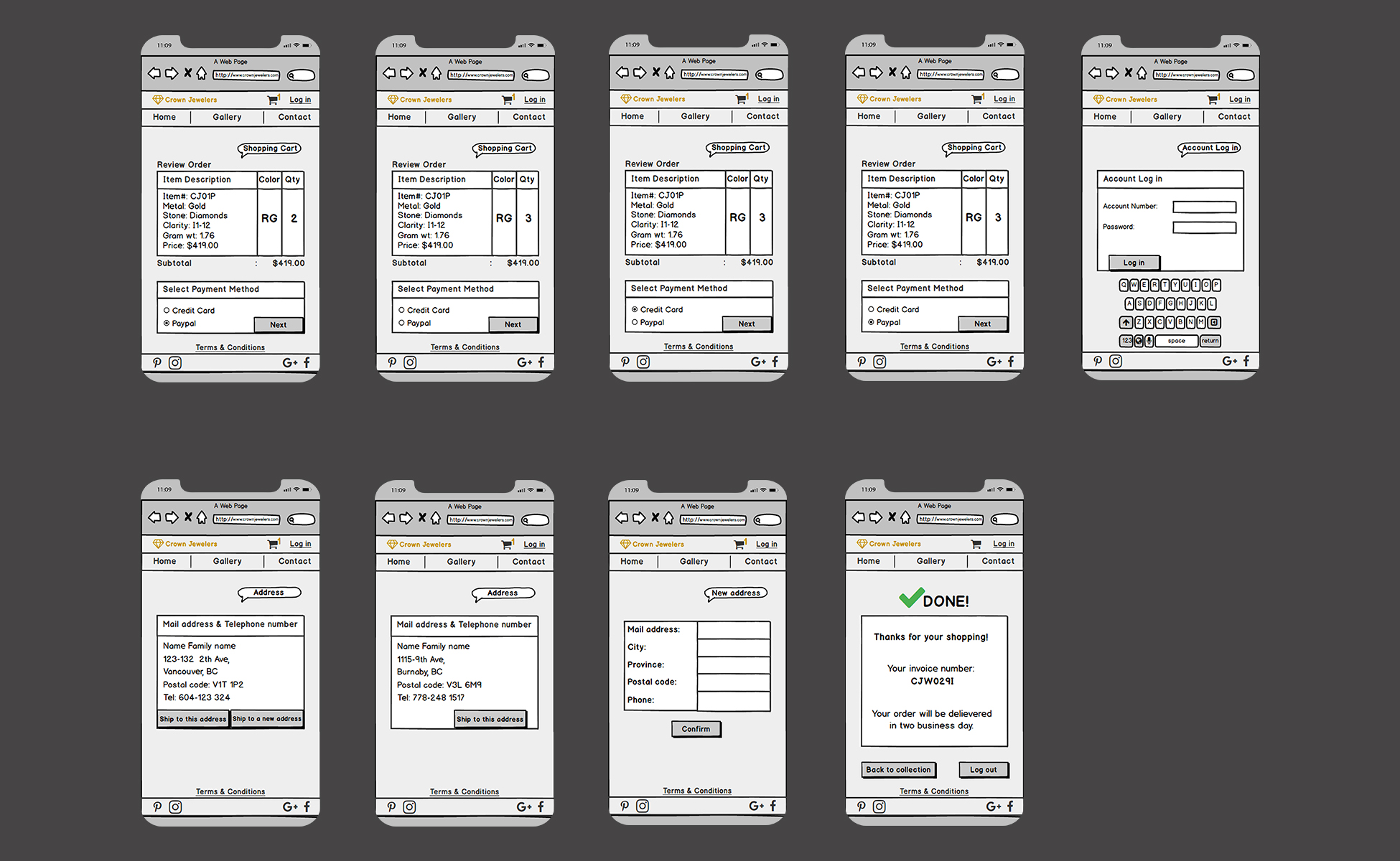
Crown Jewellers is a jewelry brand with two different main collections: Silver and Gold. In this app, the user should be able to visit the collections, choose the product, add them to the shopping cart, and do payment with choosing their preferred payment method. I designed it considering as a simple, easy to follow, and user-friendly application that even a user with a low knowledge of tech can follow the steps and does their purchases online.
Process
First I visited Crown Jewelers’ current website and its mobile version, then I tried to do some brainstorms on paper for solving the existing problems. The most crucial issue I happened to face at first glance was Information Architecture of this website. A lot of data is given to the user in one page–home page; a good information architecting is gathering all information is required the end-user knows and organize them in a way that the user can navigate through the pages at ease, without thinking or having any specific knowledge of technology. This IA works specially for e-commerce websites like the CrownJewelers’. When too much information is stacked in one space, it makes it problematic for the user to approach whatever he/she is looking for. So, what I did at first step was putting all data on the paper and organizing them into different sections and creating a new global navigation. Then I defined a task scenario by which I would make all pages the user need to navigate to do an online shopping from landing page to the step they can receive a reference number at the end of the purchase.
Task scenario: A person has decided to buy a “Gold Heart Pendant/Necklace” for his/her girlfriend for valentines day.
First I made roughs for all pages, then I started to make a foam cardboard iPhone and the cards for paper prototyping. Thereafter, I tested my prototype with 3 different people from different walks of the society. I recorded a video of one of the paper prototype user test I did. The gentleman in my video had no idea about paper prototyping and any web design stuff, the same as the other ones, also he was so worried about what was going on. I tried to clarify and explained about the project, and ensure him that there is nothing to be worried about, and he could make as many mistakes. I gave him some examples and let him do some navigation and get used to it a bit. He understood the interface easily, indeed he had no problem with figuring out what the website is about and where he wanted to go. Afterwards, I made a med-fidelity prototype in Balsamic, and did a few user testing from people of different occupations.
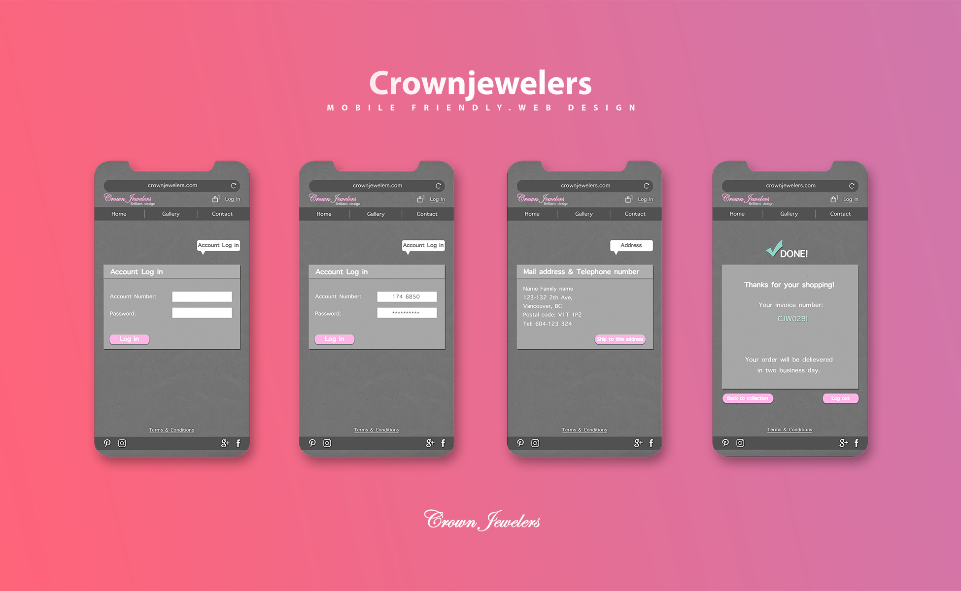
Thereafter, I developed it as a high-fidelity prototype in Photoshop, and at this stage, I made some changes based on my sample users experience results; adding color and quantity menu, making the Gallery menu active in global navigation, adding payment methods section. Eventually, I created a clickable version in Invision. I gave some other user tests and video screen captured of one of them to share in my portfolio.
Title
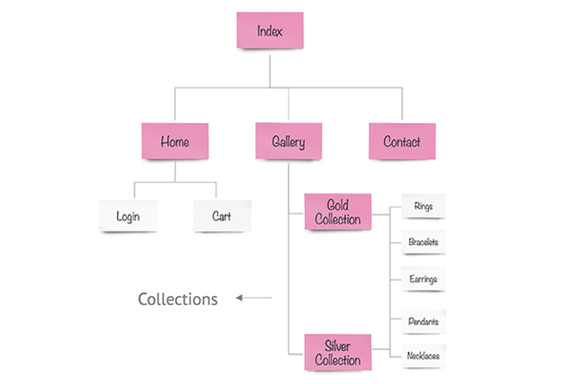
Sitemap
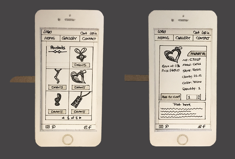
Low Fidelity – 3-4
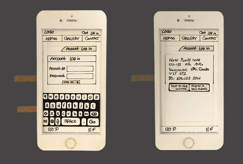
Low Fidelity – 7-8
Title
Low Fidelity – Video
Title
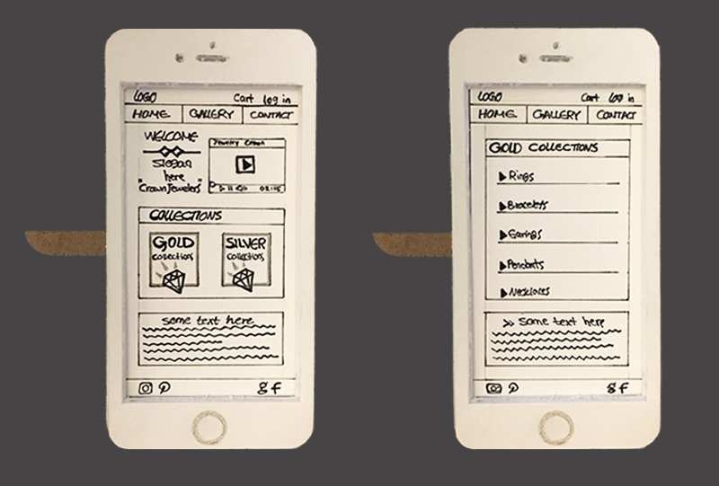
Low Fidelity – 1-2
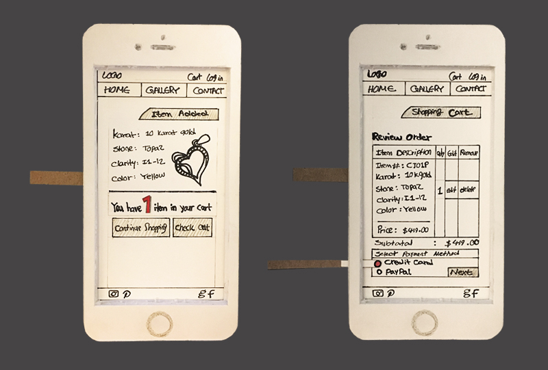
Low Fidelity – 5-6
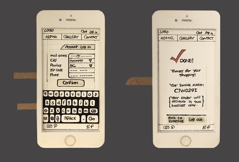
Low Fidelity – 9-10
Title
Medium Fidelity – Video
High Fidelity
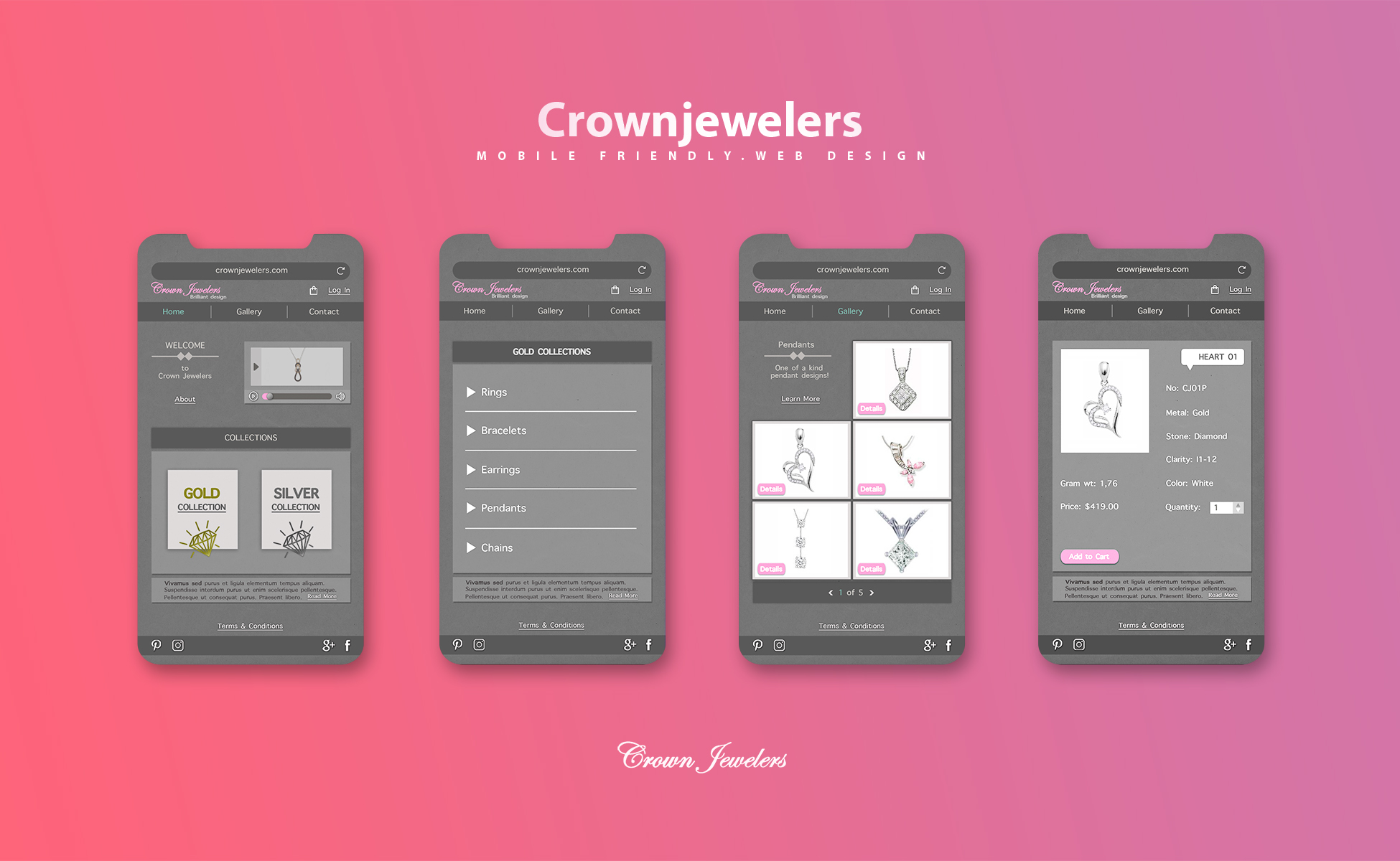
High Fidelity

High Fidelity
Medium Fidelity
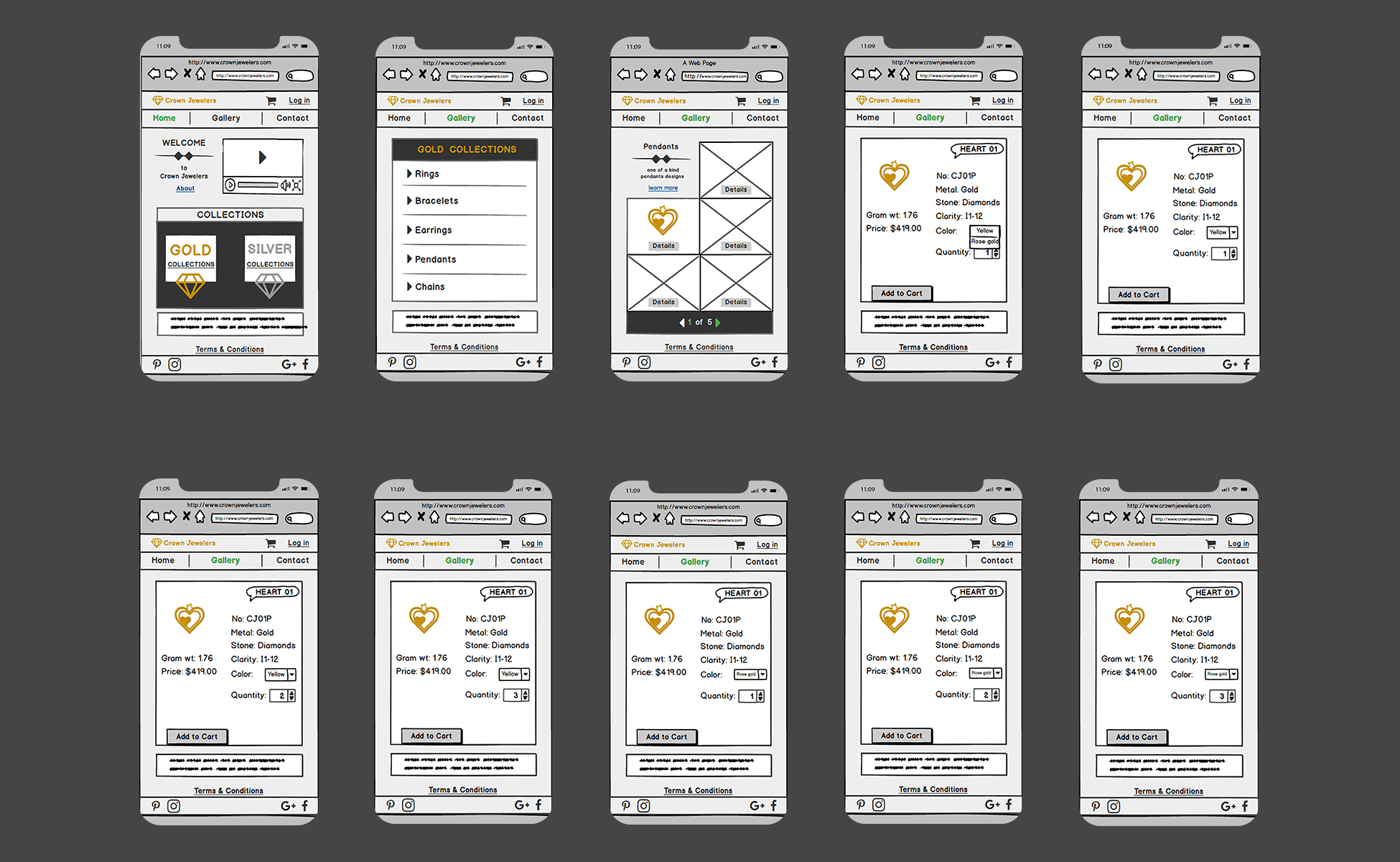
Medium Fidelity
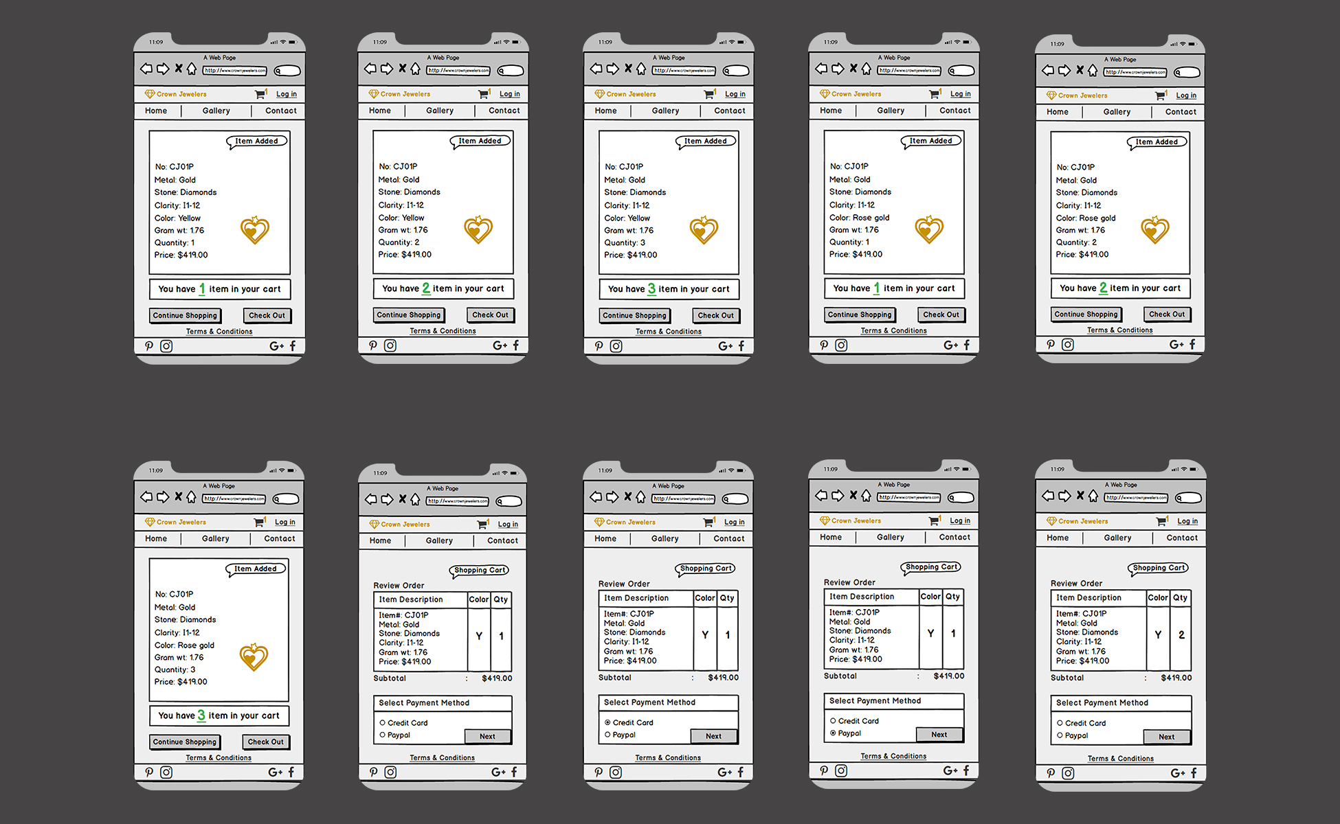
Medium Fidelity
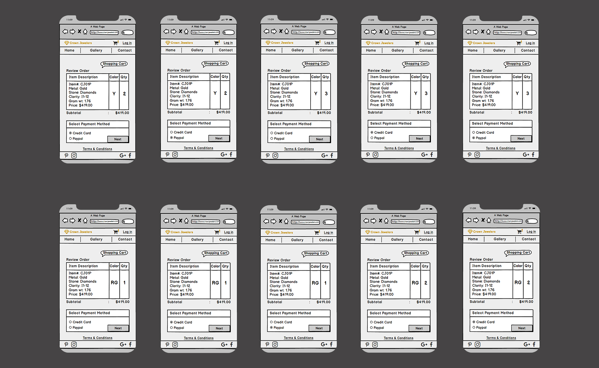
Medium Fidelity
